ONE Shot Marketing Agency Website
A website redesign focused on long-term stability, easy maintenance, and brand quality. Built to support frequent case updates while delivering a consistent brand experience.
Timeline
Dec 1 2025 to Jan 16, 2026 (5 weeks)
Team
Product Designer: Me Product Owner: Me
MY RoLE
Led client communication and alignment
Owned and managed the project flow
Designed and built the website in Framer
Information architecture and layout design
CMS structure and maintenance planning
Overview
ONE Shot Website Redesign focused on improving long-term stability and upgrading brand quality.
The goal was not just a visual refresh, but to build a website system that is easy to maintain, easy to update, and reliable, supporting ONE Shot’s seasonal case updates and ongoing business needs.
Challenge
At the beginning of the project, I found that OneShot’s challenges went beyond visual design and were rooted in structure and workflow:
Unstable maintenance and high update cost
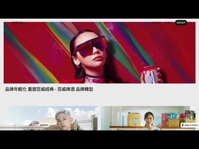
Due to previous changes in maintenance and versions, the website often broke or behaved inconsistently, making case updates time-consuming for the internal team.Visual quality did not match brand expectations
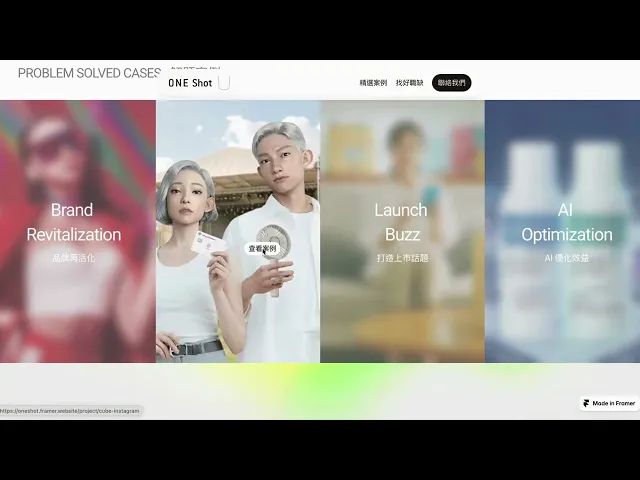
The existing site did not fully reflect OneShot’s desired image: calm, strategic, and creatively confident.Frequent case updates with an unfriendly structure
Cases and key strengths needed to be updated every season, but the homepage and case pages were difficult to adjust and easy to break.
Discovery
Through early discussions and by understanding how the website was actually used, I identified several key insights:
Serves both external visitors and the internal team
Internal members are frequent users of the site, so reducing maintenance and update effort was critical.Not a one-time launch
The website is an ongoing marketing tool that needs continuous updates, not a one-off delivery.System design, not just visuals
Layout breaking, cropped key visuals, and inconsistent video behavior across devices pointed to a lack of structural consistency in components and layouts.Audience prioritization
The website serves two audiences: potential clients and job seekers.70% Potential clients already know OneShot and use the site to validate credibility and brand quality.
30% Job seekers rely on the site to understand project types and company culture.
As a result, the hero avoids strong CTAs, case content focuses less on outcomes, and the overall experience emphasizes culture, style, and brand feeling.
These insights directly informed content hierarchy, navigation priorities, and layout decisions.
Solution
Based on the discovery findings, I defined the design strategy as a high-quality brand experience that supports real maintenance workflows:
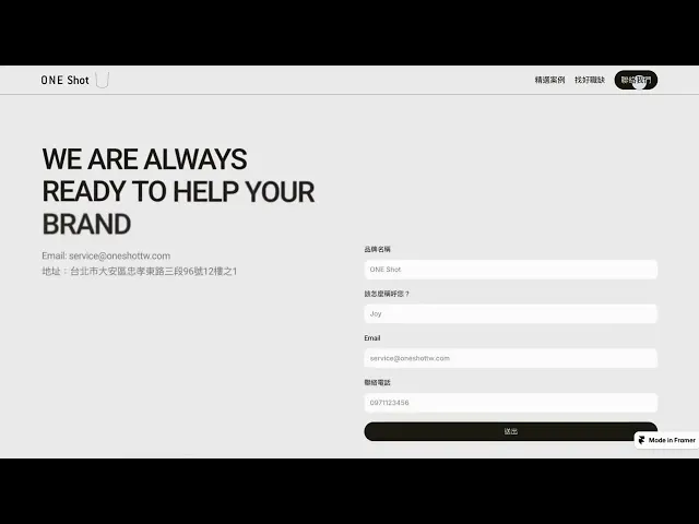
Clear role separation between homepage and case pages
The homepage focuses on building brand impression and trust, while case pages support clear categorization and deeper exploration.A CMS structure optimized for frequent updates
Case categories and tags were simplified to reduce update time and lower the risk of errors during seasonal changes.Improved responsive consistency
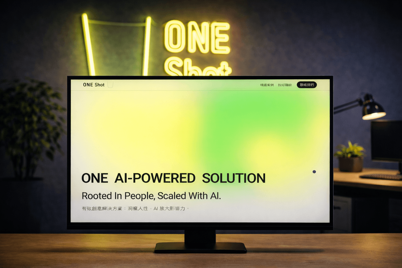
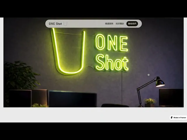
Images, videos, and key visuals were designed to display reliably across desktop, tablet, and mobile devices.Refined visual language
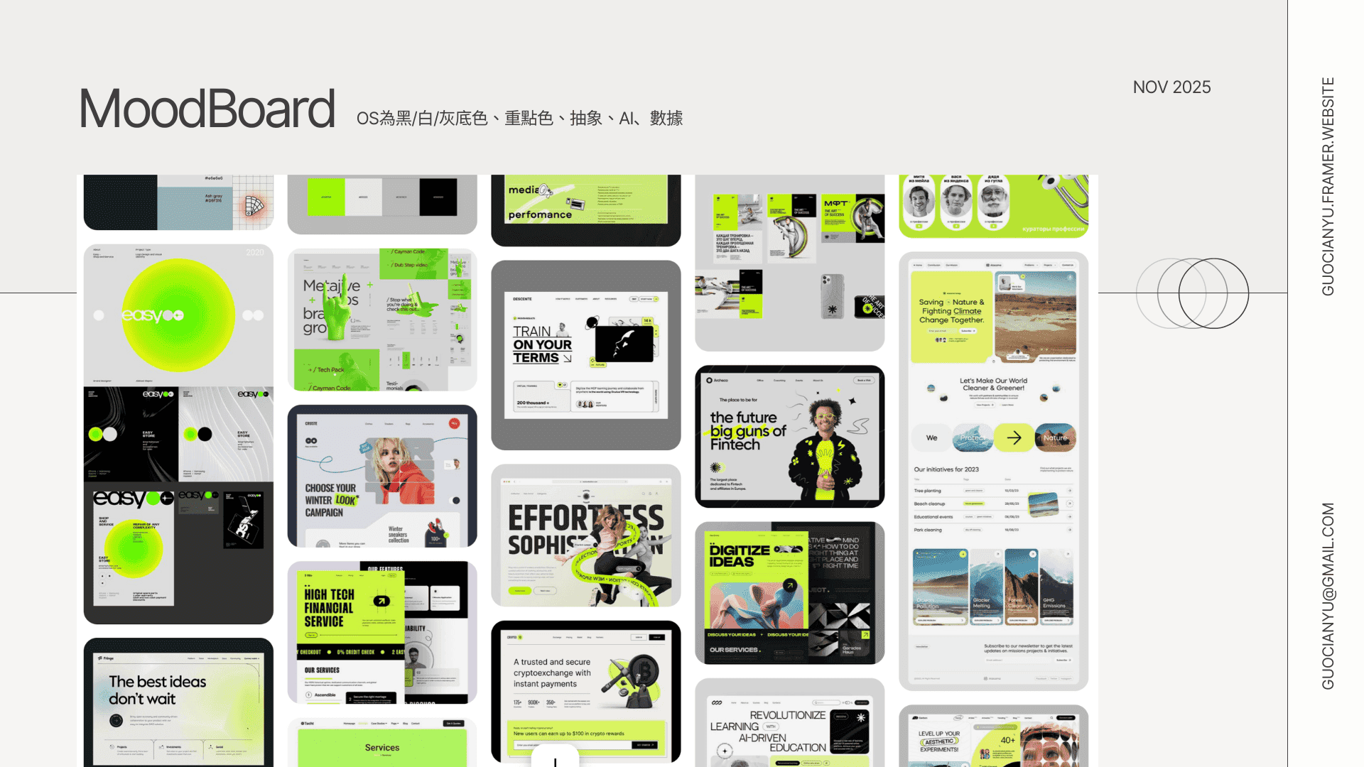
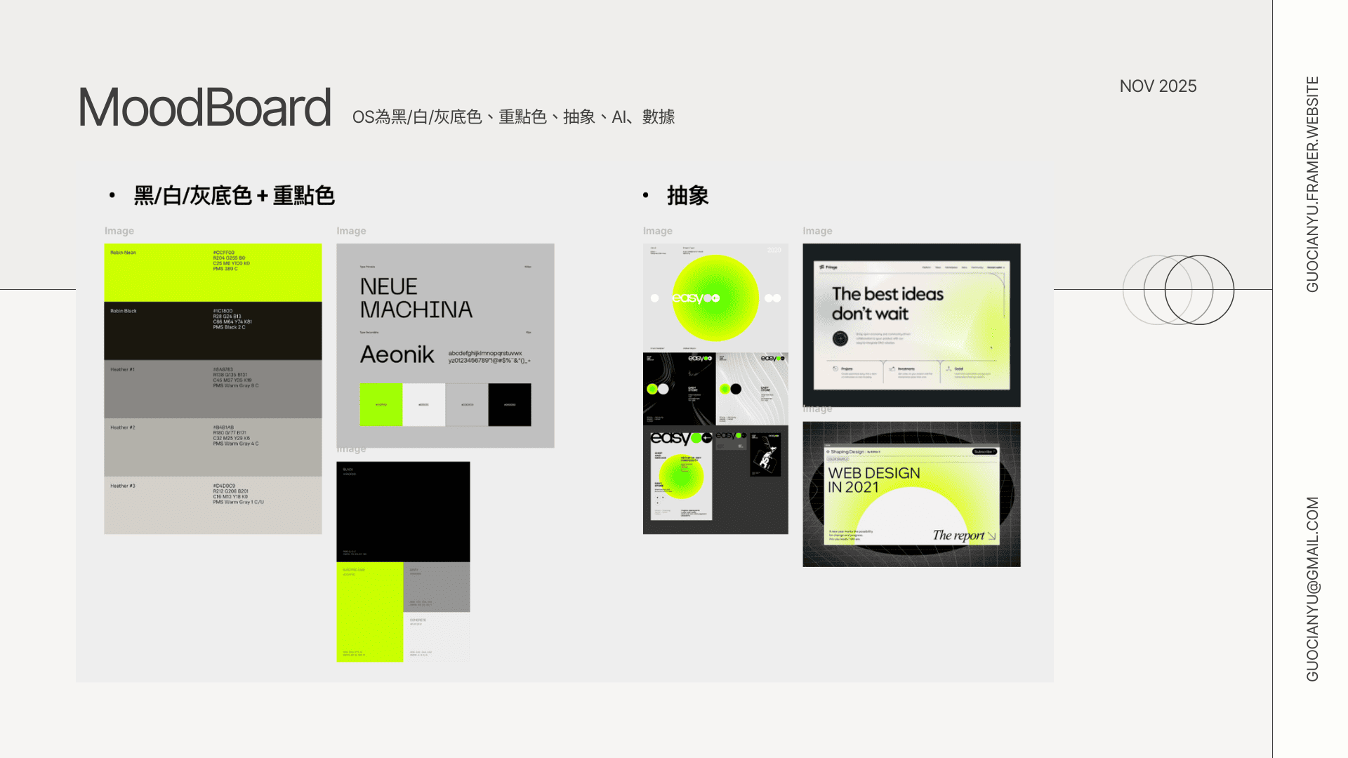
A black, white, and gray base was combined with accent colors, typography hierarchy, and layout rhythm to avoid an overly dark tone while keeping a modern, creative, and tech-driven feel.
Impact
Case and homepage updates became faster, more stable, and more predictable
Visual quality aligned more clearly with OneShot’s brand positioning
A scalable website structure was established to support future case growth, AI product promotion, and hiring needs
Continue Reading
Interested in collaborating?
You’re probably looking for someone who can help make sense of complex product ideas.
That’s usually where I come in!
I like to break things down, explore a few directions quickly, and help teams move forward with clarity.
If this sounds like what you need, I’d love to chat :)
/Email me
guocianyu@gmail.com